
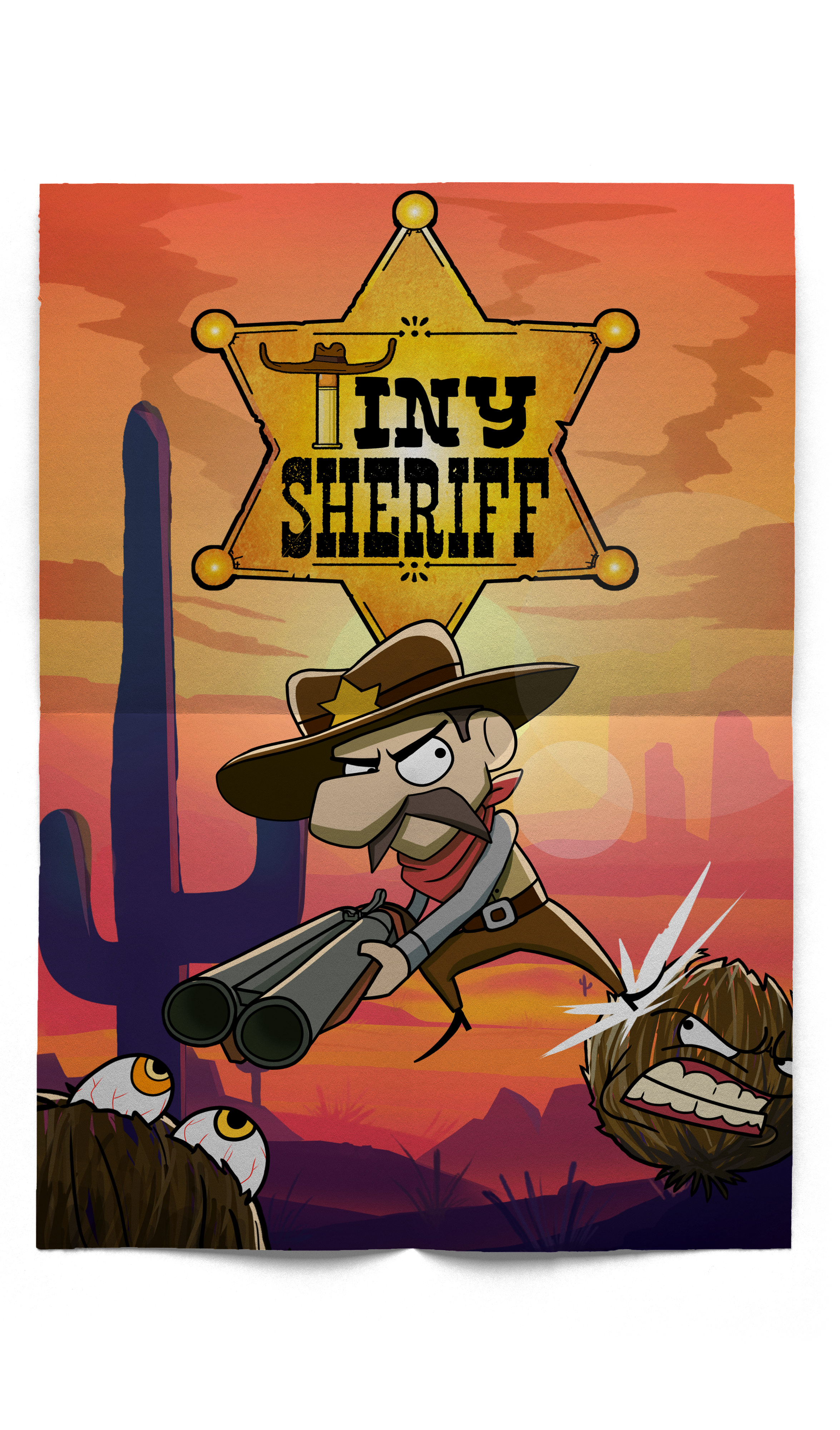
Tiny Sheriff
Project Overview
Client
Rotgut Games
My Role
UX/UI Designer (assisted with UI art & UI coding)
Timeline
Sep 2024 - May 2025
Steam Official:
My team and I developed a new game on Steam called Tiny Sheriff—a 2D movement-based platformer where weapons also serve as tools for traversal. Players must master their movement mechanics to overcome increasingly challenging levels. All assets in the game, from art to audio, were created entirely by our team without using any external resources.

Responsibilities
As the UX/UI Designer on this project, I was responsible for designing everything the player sees and interacts with, from the player HUD to the end credits. I started by drafting layouts in Figma, then built the interface in Unity, and used C# to code UI animations. I also supported our team artist by creating custom UI assets and handling common UI scripting tasks to ensure a polished, responsive experience.
User Interface Design
My design focused on three core principles:
Minimalism and Clarity – I aimed for a clean and focused interface that helps players concentrate on what matters most at any given moment in the game.
Cartoon Comic-Style Aesthetic – The visual style draws inspiration from classic comic books, featuring bold colors, thick outlines, and dynamic panel-inspired layouts. This gives the game a fun, energetic feel that matches its tone and pace.
Smooth, Seamless UI Animation – Every UI element is designed to feel naturally integrated into the game world. Instead of abrupt pop-ins, transitions are smooth and purposeful, enhancing immersion and making interactions feel responsive and polished.
UI Showcase
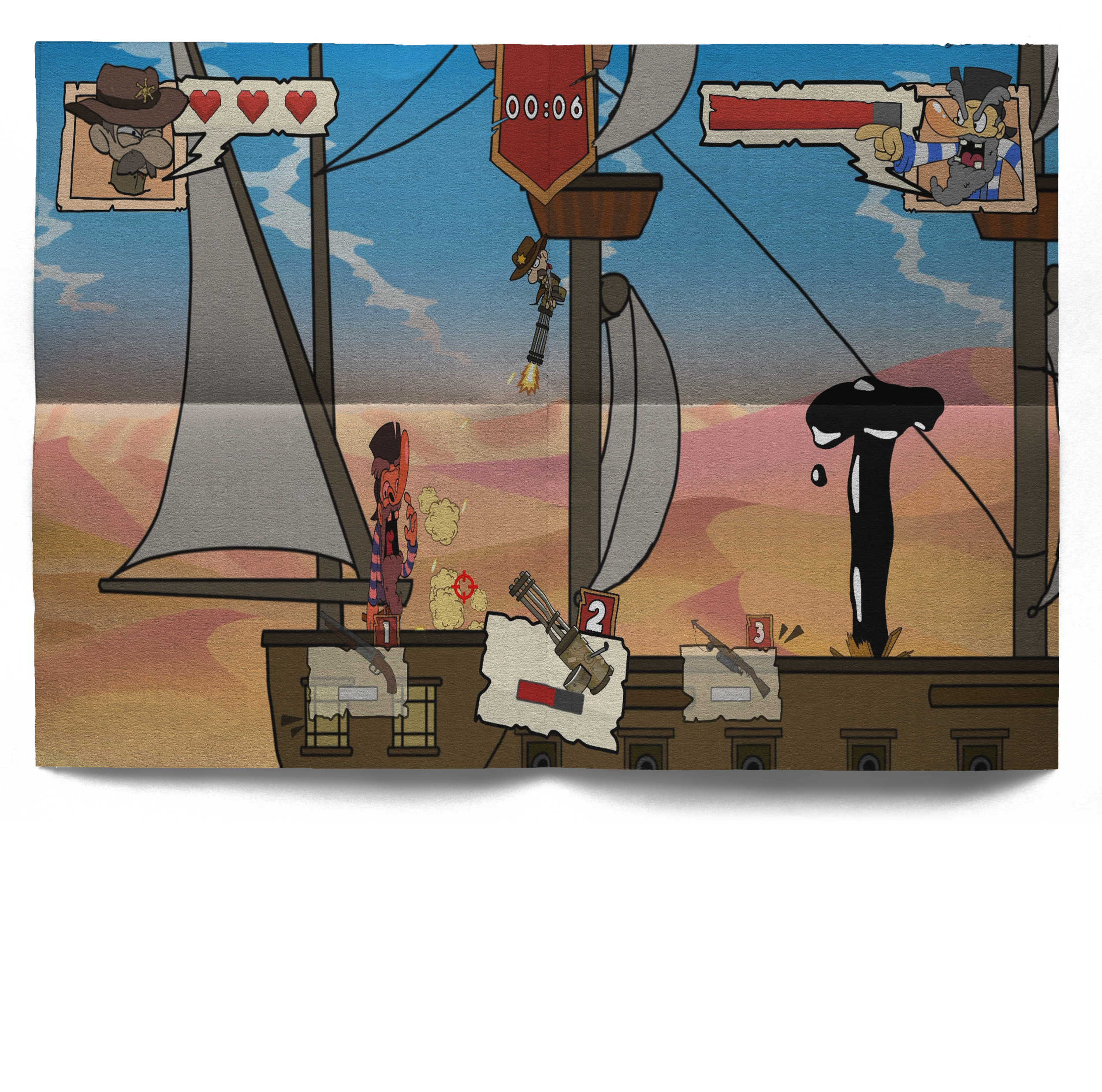
Player HUD
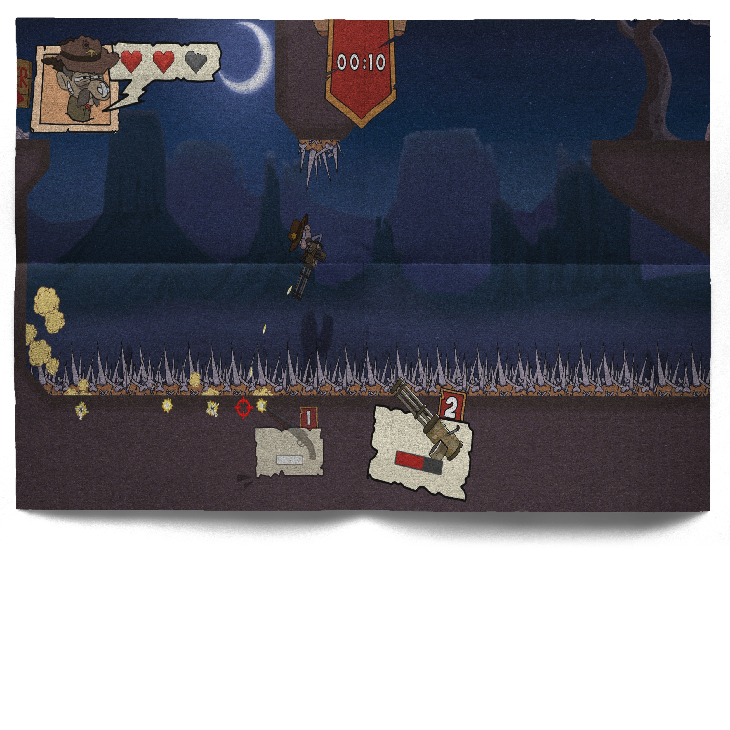
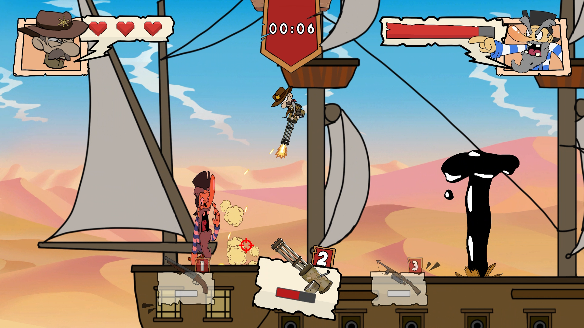
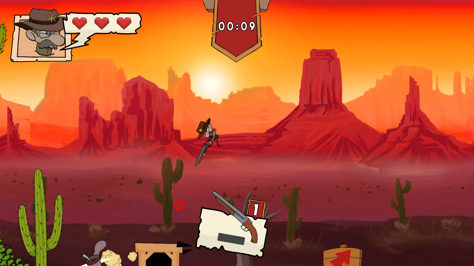
To keep the player’s screen clean and focused, I designed a dynamic HUD system that displays only what’s relevant based on the player’s current situation.
For example, while players can hold up to three weapons, the HUD only shows the weapons they’ve actually picked up, removing empty or locked slots. Similarly, the boss's health bar, normally located on the right side of the screen, disappears when the player isn’t in a boss area. This contextual approach helps reduce visual clutter and keeps the interface intuitive.
Full Loadout Equipped | Boss Battle Active
Single Weapon Equipped | No Boss Encounter
Main Menu
My goal for the main menu design was to create smooth, seamless transitions between UI screens. To achieve this, I used a custom scripting approach to implement a "staging animation" system, where the background (or stage) shifts in the direction of the selected menu option, making the interface feel dynamic and connected.
For example, when the player selects “New Game,” instead of a pop-up appearing, the background smoothly transitions to a new scene where the player is prompted to enter their name.
Main Menu UI System
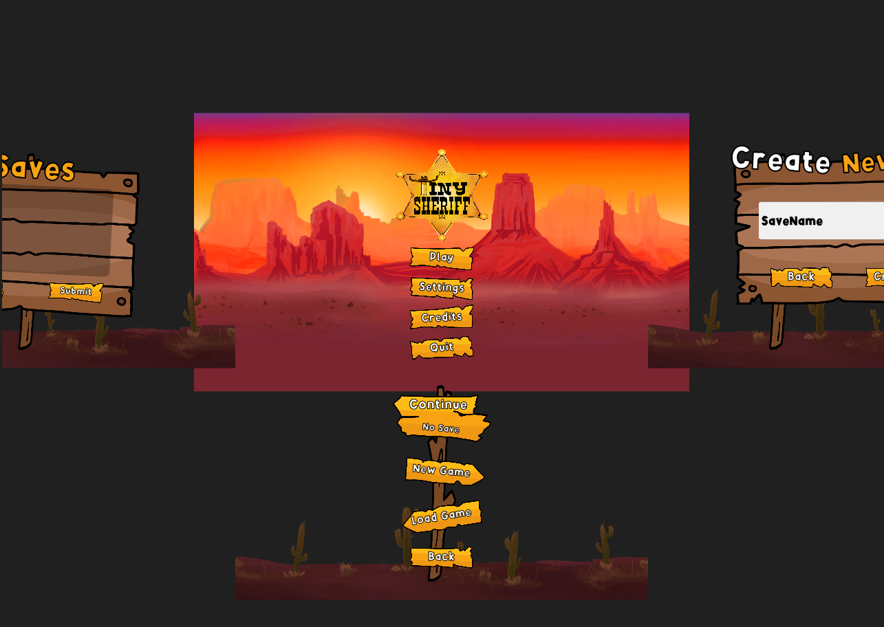
Main Menu UI Transitions
Pause Menu
My goal for the pause menu design was to create a "stop point" where players can take a break and access important information while in a level. This includes things like objectives, progress, and settings. However, when the player is in the hub world, where level objectives are not relevant, a simplified version of the menu appears, showing only essential controls like settings and the mainmenu.
Pause Menu | In-Game
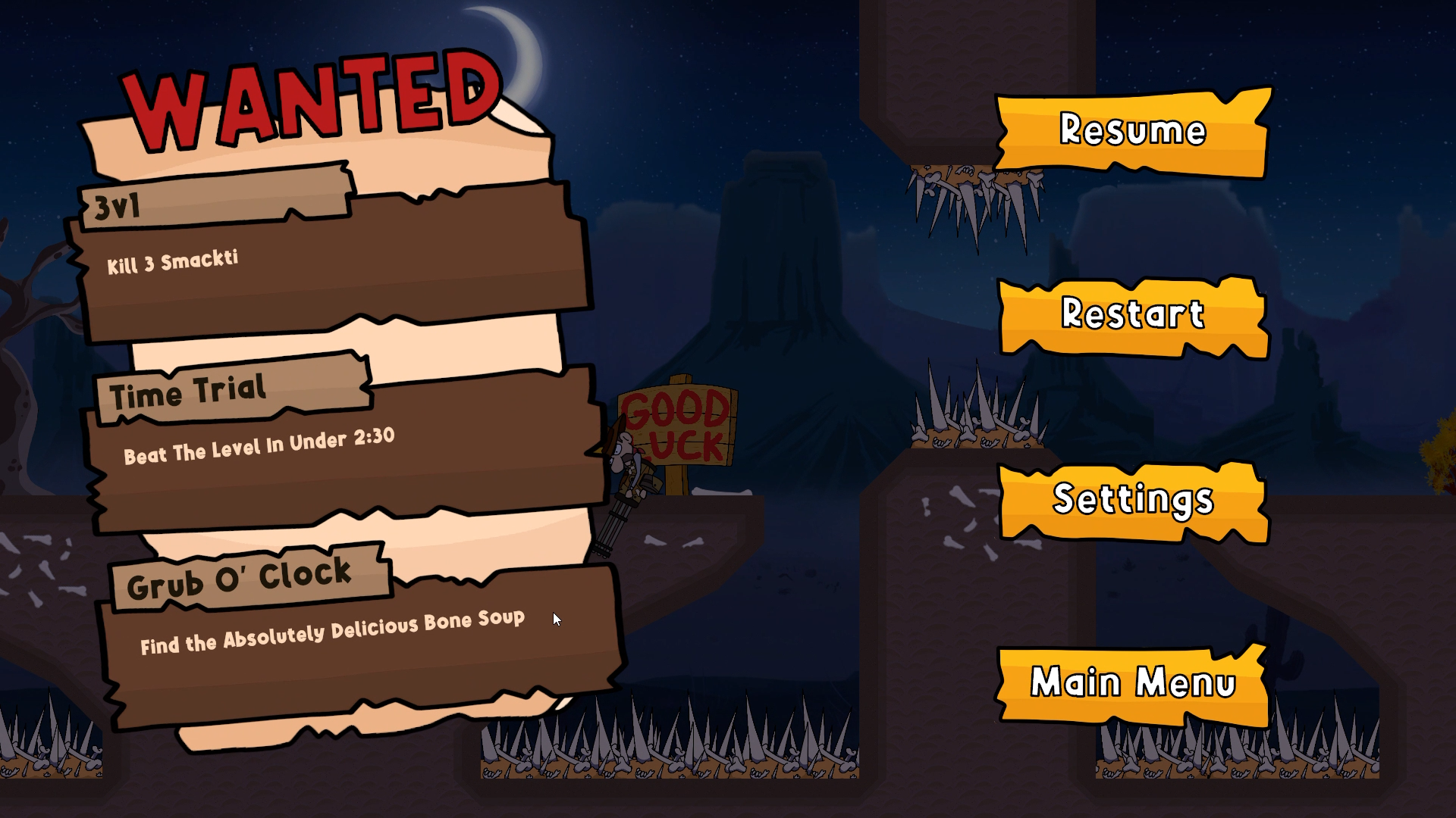
Pause Menu | HUB-World

Problem & Solution
Problem:
In the first draft version, the level objective was supposed to be in the player's HUD. However, because our game is fast-paced and demands constant player attention, displaying objectives directly in the HUD would clutter the screen and obstruct the player’s view. Reading text while dodging obstacles not only breaks immersion—it creates a frustrating user experience.
Solution
I moved level objectives and progress tracking into the pause menu. This gives players a dedicated space to review their goals without pressure or distraction. They can now pause the game, read objectives clearly on a full screen, and return to gameplay without missing key information or risking failure mid-level.
Level Complete
This screen displays the player’s progress by showing which objectives have been completed and which are still pending. From here, the player can either return to the hub world to continue to the next level or instantly replay the current one. I designed this section to be as minimal as possible, showing only the essential information the player needs to make a quick and informed decision.
Level Complete UI
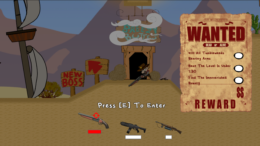
HUB World
In Tiny Sheriff, we use a hub world as the central space for players to select levels. This was my first time designing a hub world, which is pretty challenging. My design goal was to keep the UI as minimal as possible, allowing the environment itself to guide player interaction. By minimizing on-screen elements, players can explore and test their weapons within the hub space without visual distractions. This approach supports a more immersive experience while still giving players clear access to level selection.
HUB World Explore
Problem & Solution
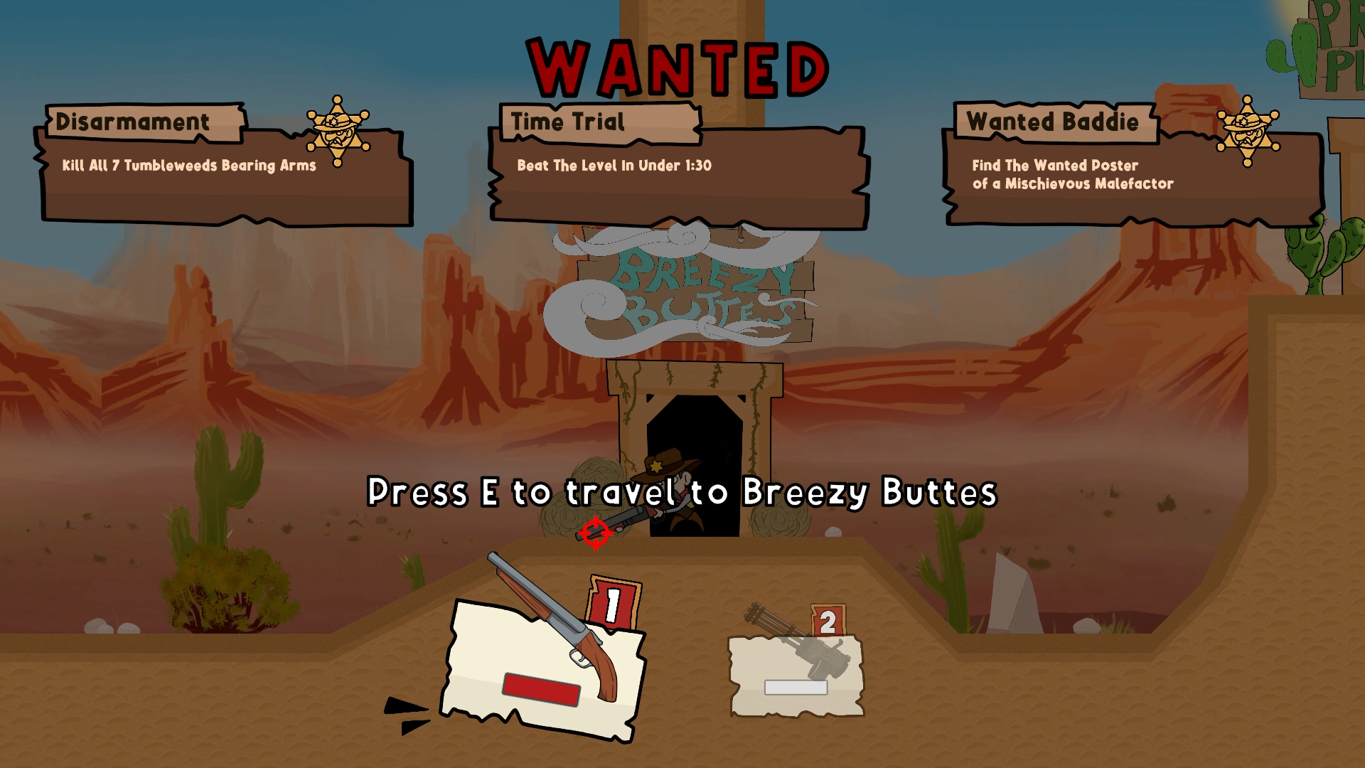
Problem:
In the first draft, the level objectives were placed on the right side of the screen, where most players naturally look. However, this layout caused issues—the "Wanted Sign" blocked the player's view of the next area and created an unbalanced composition, with one side cluttered and the other empty.
HUB World | First Draft
Solution
To resolve this, I removed the "Wanted Sign" and redesigned the layout so that each objective appears in its own box, dropping down from the top of the screen. This approach keeps the right side clear for gameplay visibility, creates a more balanced composition, and introduces smooth transition animations to enhance visual flow.
HUB World | Final
UI Assets
I designed the UI assets in a cartoon comic style, featuring bold colors, thick outlines, and dynamic, panel-inspired layouts. This visual approach was chosen to match the game’s fast-paced and playful tone, giving the interface an energetic, expressive feel.
By leaning into comic-style aesthetics, I aimed to make every element feel alive and visually engaging, while still maintaining clarity and readability. This style reinforces the game’s personality and helps create a cohesive player experience across both gameplay and menus.
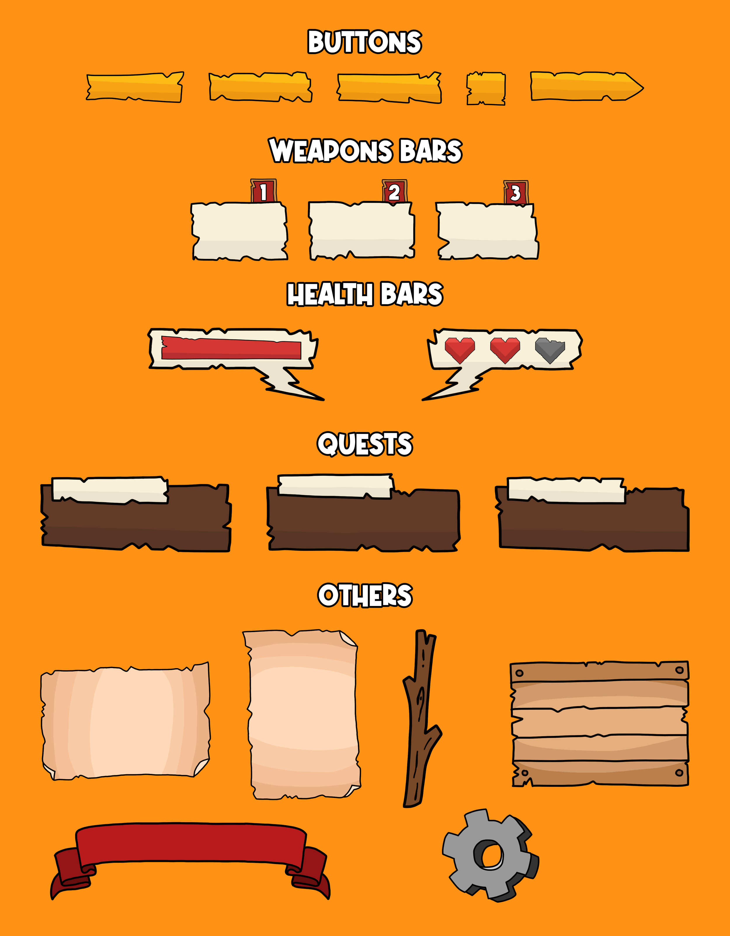
UI Assets I Designed and Drew